%\VignetteIndexEntry{1. Interface tutorial} %\VignetteKeywords{user interface} %\VignettePackage{BioNetStat} %\VignetteEngine{knitr::knitr}
The diversity of interactions that occurs in biological systems from the cells and organelles to the whole biosphere, can be assessed with tools of the networks theory. The dynamic in structure and in the interactions among elements is an inherent trait of those systems. Several tools have been proposed to compare networks, representing the many states assumed by a system. However, until the present, none of them is able to compare structural characteristics among more than two networks simultaneously. Due to the many states that can be assumed by a given biological system, we developed a statistical tool to compare two or more networks and point key variables in a system. BioNetStat is able to compare correlation networks built from gene expression data, metabolites concentrations or any kind of variables that could be statistically correlated, considering a previous data preprocessing. The networks comparison is based on graph spectra (the group of eigenvalues in an adjacency matrix), such as the spectral distribution. This measure is associated with several structural characteristics of networks such as the number of walks, diameter, and clicks. In addition to the spectral distribution, BioNetStat can also compare networks by using spectral entropy, degree distribution, and nodes centralities. Until now the BioNetStat theoretical base is available only in the master dissertation, in Portuguese. The paper is under production and will be posted here as soon as possible.
Being R and BioNetStat installed, as showed in README, you have just open R and run the following commands.
library(devtools)
library(shiny)
library(BioNetStat)
runBioNetStat()
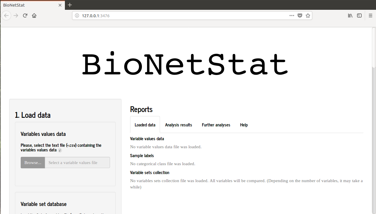
When you start BioNetStat you will see this image.

If you are using Rstudio an alternative window will open, therefore BNS will performs well when is used in browser. So, hit “open in browser” in the upper left of the screen and the BNS will open in browser as the first picture.

By clicking on the 'Browse ..' icon in section 1 (Load data) a window will open for the table of variables values to be selected.

In this tutorial the file to be selected is variablesValue_BioNetStat_tutorial_data.csv. The file will load and the software will identify the colunms classified as “numeric” by R. A previous view of table is showed on the screen. In addition, a 'Factors' section will recognize which columns are rated as 'factor' by R. In this section you can select the factors that will be used to select the states (treatments, conditions) compared, each state will be a network to be compared. The selection of states can be done in 'Choose the conditions to be compared:'

After selecting the variable values table, it is possible to load the file 'variable group' (optional) into 'Variable set database'. In our tutorial the selected file is variableSet_BioNetStat_tutorial_data.gmt that sets the groups of variables according to the metabolic pathways which they are associated. If the user does not load any files, the program will compare the networks with all variables loaded in the file 'Variables values data'


The tutorial to build your table of variables groups is here.
After load input files, you migth set the parameters to network construction: 1. Lower and higher numbers of variables (nodes) that will be in the networks compared in 'Variable sets size range'. The program returns the number of sets of variables that are between these values (figure above). 2. Dependency measure used to infer the correlation network. 3. Association strength that will be used as the threshold for the formation of an edge between two nodes and which threshold value is used. 4. Type of network to be built, with or without weight on the edges. In the case of nets with weight, which measure of association will be used as edge weight.


After loading the files and selecting the analysis parameters, click on 'Start analysis' to compare the networks.


you need to insert a table that contains two columns, where the first one must be the names of the variables you are studying and the second one is the respective KEGG code of these variables. The KEGG codes can be found on KEGG's website. In addition to the table with the codes of the variables should be chosen the color used in the draw, if the variables studied are genes/proteins or metabolites. The variables that will appear in the figure are the same ones analyzed in the differential analysis table of the node and they can be filtered or according to the value of the test or the pvalor or the qvalue associated with it. It is necessary to choose which metabolic pathway will be used to produce the visualization and in which Species.

On the map KEGG, you will notice one that the rectangles or the circles are divided into columns, representing the treatments you chose to compare. The intensity of the colors is relative to the values of centralities chosen according to the legend. here is an example of a map constructed with genes from the pathway in cancer (05200) of kegg, for humans (“hsa”).

When clicking the button to save it is necessary to wait for the program to download the map, save it in the “Downloads” directory in a compressed file. The view is inside the compressed file.

Visualizing networks helps us understand the changing patterns more easily. This visualization can be done in several ways and some of them are available in BioNetStat in the “Network visualization plots” tab. As several states can be compared by the BNS in this section you need to choose only two of them to be viewed and compared each time.


BioNetStat also provides a study of the behavior of the variables so that the user can have a complete view of their object of study. 1. Initially the variables can be explored through the construction of a heatmap where the parameters of the figure are selected. In the columns are the samples with the colors indicating to which state each sample belongs. It is possible to group both the columns (samples) and the lines (variables) of the heatmap in the section “heatmap cluster options”.


On the map KEGG, you will notice one that the rectangles or the circles are divided into columns, representing the treatments you chose to compare. The intensity of the colors is relative to the values of centralities chosen according to the legend. here is an example of a map constructed with genes from the pathway in cancer (05200) of kegg, for humans (“hsa”).

When clicking the button to save it is necessary to wait for the program to download the map, save it in the “Downloads” directory in a compressed file. The view is inside the compressed file.


